Eclipse Data Analysis - GLOBE Observer
Eclipse Data Analysis
In addition to collecting data, we also encourage citizen scientists of all ages to try their hand at analyzing the data. Below you will find links to downloadable data files, example graphs, and tips and tricks for accessing the data systems yourself. We will update this page with data from future eclipses as they occur.
 NOAA's Science On a Sphere program and the GLOBE Program are collaborating to display your data at nearly 200 museums and science institutions around the world that have Science On a Sphere. You may have one close to you! We also have a mobile version that you can download. Science On a Sphere is a spherical visualization display system that presents amazing Earth data and visualizations. For the 2024 eclipse we will use it to display the data you collect on the 2023 eclipse! You will be able to see how temperature changes across the country on a 6 foot sphere or even in your own phone, and learn more about how community science can provide amazing data for science and education."
Data from Specific Eclipses
Because the eclipse is such a time-focused event, we have been able to pull some data sets that might be useful for a variety of people, and could save time in accessing the data, available on the Get Data --> Eclipse Data page. For additional data, see the data access options further down the page.
Example Graphs
Below you will find some example graphs from the data collected during the eclipse on August 21st, 2017 (click here to download graphs as a PDF).
Accessing the Data
There are three primary ways to access GLOBE data. The first is the GLOBE Visualization System, which allows you to add layers of data (for example, here are links with clouds and air temperature layers from the eclipses on August 21st, 2017 and July 2nd, 2019). Tutorials are available in PDF and PowerPoint formats.
While the data visualization system system allows a quick view of the data, and some comparison between data sites using the multi-site plots tool (graph icon in the upper left menu), in order to do more detailed analysis, you will need to download the full data tables. There are several ways to do that.
1. The first option is through the GLOBE Data Visualization system itself. Click on the expand options dots to the right of the layer you wish to download, select View Layer Table, then Export .csv in the window that pops up.
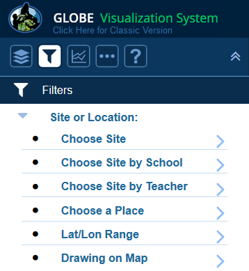
If you don't want the entire layer, it is also possible to subset the data by using the filters feature. You can filter by a place such as a state, country, or even proximity to a geographic feature such as a lake or a river. You can also choose a latitude/longitude range, or draw a shape on the map. Once you have selected your filter, follow the directions above to download the layer table.

2. The second option is the GLOBE Advanced Data Access Tool. This allows you to filter by more than one protocol at a time, as well as for a range of dates. ADAT can be powerful, but also may be less intuitive than starting from the map as described above, so choose the tool that is best for your purposes.
3. The third option is the GLOBE API, built to support developers who would like to retrieve GLOBE data from a programmatic interface. The API provides fast access to GLOBE data through a variety of API calls including the ability to find data by protocol, date, latitude/longitude, country and more. Each API call is associated with a unique URL and combination of variables. This is a more advanced way to access the data, but may provide the combination of options you are looking for.


